Hi!
It is great to see all the new UI updates across the forums. I've now had some time to use some of the different features, so here are my thoughts of them.
Some additional information, I primarily use a Laptop/PC/desktop on a Firefox-based browser, so that is where my perspective lies.
I like the new look of device page editing and putting the not-so-often-touched features in separate tabs really cleans them up! The layout feels more "focused" and refined, I love it!
There are two features of the device page that I particularly miss:
I really miss having the preview option when editing a device page. Being able to preview the page while editing makes drafting and revising much easier. I tend to use this a lot when working with tables, links, and other formatted data to make sure they're coming out correctly. This is especially useful when editing a device page that you cannot approve yourself/ making edit proposal to a device page. And it would reduce the need to submit multiple revisions in order to confirm formatting.
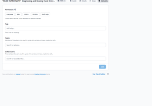
This is a minor one. I miss the custom reputation permissions in the metadata tab, OR the option of the "standard" 500 reputation permission for users to edit the page. The addition of predefined reputation levels in the new UI is really nice (and nifty to limit the maximum reputation permission to the reputation of the user), and I love the feature that the fine print explains how many users can approve changes based on the selected reputation, it gives a much better indication of how much the reputation permission is restricting.
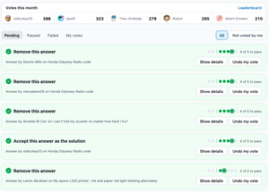
The new moderation UI did take me some time to get used to and I've tried to give it some time. I've briefly checked the page in a simulated phone format (through desktop browser's developer tools), and there I do like how this looks and it works really well. It is great to see the mobile-first approach. For both PC and mobile, I do like that a lot of clarity has been added, e.g. as it is more clear when users are disagreeing on a moderation which could be unclear before, and I like that a lot more information is now shown. I also like the added clarity on "what the moderation does".
Though on desktop, I find the moderation tab honestly a bit messy or cluttered. Sure, when having voted on moderations, it tidies itself up a bit. However, especially before having voted on everything, I find it somewhat a cluttered. I think this may be because there is a lot of things going on visually, on top of having less "visual" separation between the different moderation issues.
I have not yet done any major work in the of new UI for guides. But so far:
Overall I like the new UI. Everything feels a bit clearer and cleaner. I like the small handles by each line/bullet points. and I like the new markup options by the line/bullet points. I like the new feature of opening the images in a large preview (and I hope we will get to see this feature when the viewing of the guides and in answers too). In general I also like all of the small changes that has been made that makes working in guides smoother.
And all the changes (and the things I miss) with the device pages applies here too.
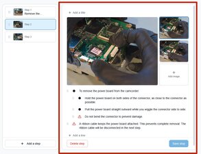
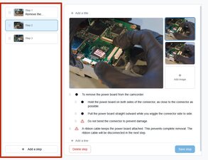
But my two caveats would be that I prefer the slightly larger standard text in the old UI compared to the new UI. The second caveat is that I feel that the step-box area on the left hand side uses a little more space than necessary. I do like the general design principles with the step-box area, with the handles and the new look. It is a nice idea of including the step titles, however, the space available for the step titles is limited, so only a small amount of the title is readable. I would personally prefer to reduce the width of the step-box area in order to give more space to the "main area", and then the text size of the "main area" could also be increased.
Main area meaning (red square):
Step-box area meaning (red square):
I really like where all of these new changes are taking the UI. It will make using the forums much easier and pleasant. Thank you all for the great work you've done with all of these UI updates. I appreciate how much effort it must have required. I am also grateful that you are reaching out to us for feedback!
Thanks a lot,
Cheers


 265
265  101
101  9
9 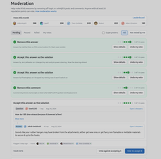



1 Comment
@kyle looks and feels good with a slightly more intuitive UI. Thank You to the OP's team
by oldturkey03